Tag Archives: building stuff

Herding cats, or managing GitHub issues – Waffle and HuBoard considered

Today I needed to decide on a tool to use to manage GitHub issues. I’ve got so many of these now-a-days that it has become quite hard to decide which one to work on and also to communicate to others which ones I am working on.

So I turned to some of the simple Kanban board visualisations of GitHub issue tools that I’ve seen. There may well have been others (I’m pretty sure that it’s possible to get Trello to work with GitHub) but I wanted something that was simple.

I ended up comparing waffle.io and huboard.com .

HuBoard

I found that HuBoard had in many areas some cool functionality that could well be something I wanted. In particular it has the ability to mark a task/issue as “ready for next stage” and “blocked”. Blocked issues are particularly important to me – so having this clearly visible is important. Additionally HuBoard claims to have existing integration into Slack – that would be pretty cool, but given I already have GitHub integration into Slack, I’m not sure it’s needed. Would have been nice if the web-site had shown what that integration actually was, as that is something that could really decide me one way or other.

HuBoard has a nicely minimalistic view – more inline with newer design patterns like Android material design, SAP Fiori. Labels on issues are small colour coded lines that appear when you hover over them.

huboard design

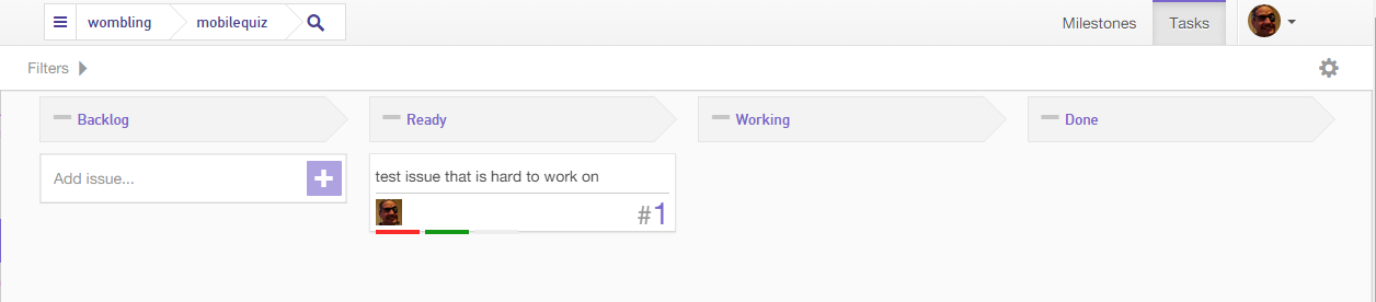
It’s quite neat and tidy. It also has a cool “fade away” filter option that just fades out un-selected items rather than removing them (two clicks removes them). However, clicking the same button multiple times to get different affects, I’m not sure that’s really a great idea. I’ve definitely been slapped over the wrist for bad (and not very accessible) UX when I’ve done similar things in the past. But technically and from a usefulness stake (if you understand what you’re doing) that’s a pretty cool feature.

However, I there were some concerns – when I loaded the HuBoard site on my phone it was good to see that it adapted responsively to the space available and listed the items rather than displaying a grid (well, I’m still debating if that was good, but at least it was responsive.) However, when I then clicked on a issue:

mobile huboard issue small

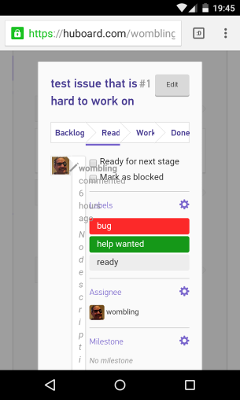
Yuck! that’s not usable.

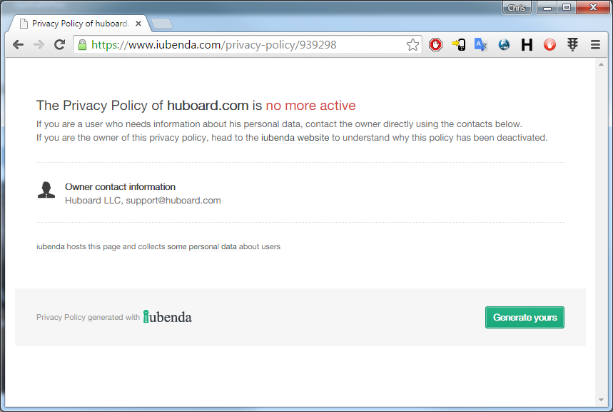
Edit: NB see note following stuff documented in following section about privacy has been changed.

I then looked at the site to understand what the privacy policy was:

privacy policy from HuBoard missing

The only info on the site was “This Application collects some Personal Data from its Users”.

I’m pretty sure this is because of HuBoard not paying someone for their generated policy:

huboard policy issue


However, I tweeted at HuBoard:

And as at time of writing this post, haven’t had a reply. To me, if I’m going to trust a cloud service, I need to be able to understand what it will and won’t do with my data. A non-working privacy policy page on the main site is a BIG #fail. Then not to respond to someone @ mentioning your twitter handle is a mark of the kind of service that I might expect if I was a customer. Not great.

Edit: so none other than the founder of HuBoard reached out to me. Privacy policy is fixed. It looks pretty good too, most of it is in plain English not legalese. Guess timezones for USA meant they were sleeping. The founder reaching out, that’s pretty good customer service. These guys will hopefully do some great things!


Waffle

I looked at Waffle.io. Now bizarrely the thing that most scares me about that product is its price – $0. I’ve learnt, if I’m not paying $ for something, then I am the product. I’m not sure if Waffle.io is still in beta/investor funding and is happy running without making any money but perhaps just piling up the company valuation? This whole SaaS valuation model sometime confuses the crap out of me. When you consider that companies the size Workday have profit margins of -24% (I mean WTF ?) It’s quite conceivable that charging money right now doesn’t boost the value of the company as much as having more subscribed users. Still paying nothing for something just makes me want to look for the catch. But I couldn’t really find a catch (I imagine it won’t be free forever and that payment will be required soon, but if it’s in same sort of price point as HuBoard then this shouldn’t be an issue $24 a month to be productive is not that bad!)

Waffle has some feature that I thought were pretty good, but specifically I liked the “size” attribute for an issue. By using this I can ensure that for each stage of the Kanban there aren’t too many issues being dealt with. So it can be fine to have quite a few small issues, but having the same number of large issues could cause a problem.

waffle


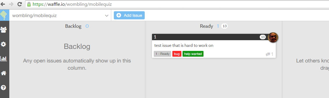
at the top of each column was a counter showing the number of issues and the total size. Next to my lovely picture was a number showing what I thought the size of this issue was.

This functionality I like, it will help manage all the issues and ensure we’re not going crazy pushing so much to into testing without actually testing it.

It was also nice in Waffle to be able to see the number of comments an issue has – it’s often worth drilling into those issue that have a lot of comments, even if it’s not yet my issue.

However, compared to HuBoard the amount of information shown can result in a quite busy screen – for example from Waffle’s own GitHub repo…

waffle2


Personally, I didn’t mind the “noise” but others I spoke to thought perhaps the minimal style of HuBoard better. Since I often have so many labels that colour alone is going to be an issue, I think I prefer this layout.

In contrast to HuBoard the mobile interface is not at all responsive, you see the same site but just zoomed out so you can’t read anything. That said, pinch zooming and scrolling around on the phone isn’t hard, and it does give you a better perspective of how the lanes compare. I’m pretty sure that there is probably a better responsive layout that could be adopted. But compared to the rendering mess that happened in HuBoard when accessing from mobile, it was much easier to use the Waffle site.

Conclusion

You can probably see where I’m heading! I decided to go with Waffle for the moment, but I’ll keep an eye out for HuBoard. As with all these SaaS apps, iteration is the name of the game, and I’m sure that feature parity won’t be far off. Neither tool has an Android mobile app, but neither tool is very usable on a phone – so perhaps when one of them makes that leap it will differentiate itself. We shall see.

After I’ve been using Waffle for a while, I’ll perhaps write another post about “real life” experience.

Cheers!


iOS – not quite the Enterprise developers’ best choice

I was recently at a conference where there was a big cheer from the audience when the vendor announced that they were moving away from a model of updating all the customer’s development/test and production systems 4 times a year, to a model of still doing quarterly updates, but updating the dev/test environment one month earlier. The crowd cheered. Wow! (The conference was SuccessConnect, the product SuccessFactors and the vendor SAP, but that is irrelevant for this particular post).

So why on earth would people want to get their software updated later? And why would such a change cause them to cheer? It’s quite simple really! Risk reduction.

risk reducer


Reducing Risk

To quote Donald Rumsfeld “there are known knowns; there are things we know we know. We also know there are known unknowns; that is to say we know there are some things we do not know”. Whilst it’s blinking difficult to deal with the third category of “unknown, unknowns”, it’s much easier to deal with the known unknowns. In our case of software upgrades, we know that there are likely to be changes, but we aren’t sure exactly what. So having a early release in a system that isn’t critical for the running of our business, means we have the possibility to make those known unknowns into known knowns and deal with them. (hmm perhaps I shouldn’t have quoted Donald, this is getting a bit confusing! – but hopefully you get the point!)

Basically what was being offered was a risk mitigation strategy, and the enterprise just LOOOOOOVES that.

Back to Mobile apps

OK, so what’s this got to do with mobile applications? We’ll basically for mobile applications in the enterprise space we should be able to offer the same thing. I’m not talking here about applications that companies develop internally and deploy to all their staff, but applications found in application marketplaces (app stores if you will) that are used by enterprises.

Say there is this great app out there that allows you to track the driving speed and location of all your delivery truck drivers. It’s great because the same functionality just a few years ago cost thousands of dollars per truck and had to be downloaded manually each night. Now, you have it instantly and at a subscription cost of $20 per user per year, with awesome real-time reporting and everything! Great! But the reason it is so cheap is the developer is selling this software in a SaaS model. They have a multi-tenant architecture and when they make an update they update all customers at once. Now what happens if they push out an “improvement” in the user interface of the solution? Well 90% of your users will probably adjust, but 10% (or more) are suddenly going to be referring back to that print-out of the training material that you sent them getting very confused, phoning the help desk and generally finding an excuse for not doing work. Bad!

But had you known that a change was coming, what could you have done? Well, you could have updated the training material, sent comms explaining the wonderful new feature, etc.

So how could you have know this change was coming? Well the company that you’re subscribing to could have sent you some details about the change. But what if they thought that the change was so insignificant it didn’t need any comms? And  what if it’s just the particular way that your workforce use the app that means that it might need explaining? Then you are going to need another plan.

Another plan

chrome beta

In the Android application marketplace (Google Play) there is allowed the concept of a Beta version of application. Many popular applications (for example Chrome and Firefox) have beta versions of their software that showcase and test out new versions of UI and functionality.

This allows companies to test out new versions of software before their major install base start using it. And because the software is flagged BETA people know that there might be things different. It is a risk reduction strategy for not only the consumers of the software but also the developers. Win-Win!

Apple however in their app store submission guidelines: https://developer.apple.com/app-store/review/guidelines/#functionality

2.9  Apps that are “demo”, “trial”, or “test” versions will be rejected. Beta Apps may only be submitted through TestFlight and must follow the TestFlight guidelines

and from the TestFlight guidelines: https://developer.apple.com/app-store/Testflight/

External Testers (Coming Soon)

Once you’re ready, you can invite up to 1,000 users who are not part of your development organization to beta test an app that you intend for public release on the App Store.

So instead of making a publicly available Beta version they are going to restrict to a maximum of 1000 Beta testers. Not so good for that SaaS developer with over 1000 customers is it? And even then – that functionality isn’t even release to the market yet! The whole TestFlight thing was only announced a few days ago!

In summary

So back to my title – if you’re a SaaS developer and you want to help your customers by reducing your risk and theirs in the mobile application deployment space, build for Android, not Apple. If you care about enterprise, then be aware that risk mitigation is a big thing. The reality is that as an enterprise developer we need to deliver for both Android and Apple devices, but one of them is clearly more enterprise friendly in one particular respect.

Would be great for Apple to take this on-board and offer a unrestricted “TestFlight” program for enterprise software developers… We can cross our fingers and hope!

Building a card robot

Today was a very relaxing day, where I tried not to involve myself in any work related stuff at all.

So I asked the kids what they wanted to do this morning. They said, build a robot.

Robots made from construction paper

So we did. Unfortunately, they (the kids) are probably still a little to small to get into Lego Mindstorms or programming and wiring my Raspberry Pi to run some servos, so we went for the next best thing. Cardboard.

robots made from paper

I made some nets (a net here being a 2d diagram for a 3d shape) for the different parts of a robot, we printed them out onto some card, cut them out and stuck them together. The kids decorated the robots with some great creative flair.

It was a great fun day that I would recommend to anyone who finds the weather not suitable for playing outside and want to do something a little different.

Just in case there is anyone else out there in a similar situation I have attached (linked below) the print-outs that we used to build the robot. Cut the solid lines and fold (in most cases) the dotted lines. I printed these onto construction paper and it worked really well. Scoring the to be folded lines using a ball point pen and a ruler is highly recommended to ease making the folds in the right places. A decent quick drying glue is a good idea too – glue sticks just don’t work for this stuff.

card robot legs net card robot head net card robot body net card robot arms net

They look like:

net for constructing a set of legs for my paper robots - see PDF for high quality version

I’ve licensed the the plans/net/images (however you want to refer to them!) under the a very unrestrictive creative commons license so you use them and play around with the safe in knowledge that I’m cool with that.

Creative Commons License
These works by Chris Paine are licensed under a Creative Commons Attribution-ShareAlike 3.0 Unported License.

Although the linked PDF versions are higher quality 🙂 They are designed for printing out onto A4 paper. Although you could/can fit two of the head nets onto one piece of A4 if you fiddle with it.

I hope someone, somewhere, sometime reads this and finds it of use. I know I tried searching the Internet for “robot card net”, “paper robot diagram”, “build your own paper robot” and other such in the hope that someone else had already done the hard work. Perhaps with the magic of Google someone else will search and find this… (if you do, please send me a note, I’d be most happy to find out! 🙂 )

Cheers!