Today I needed to decide on a tool to use to manage GitHub issues. I’ve got so many of these now-a-days that it has become quite hard to decide which one to work on and also to communicate to others which ones I am working on.
So I turned to some of the simple Kanban board visualisations of GitHub issue tools that I’ve seen. There may well have been others (I’m pretty sure that it’s possible to get Trello to work with GitHub) but I wanted something that was simple.
I ended up comparing waffle.io and huboard.com .
HuBoard
I found that HuBoard had in many areas some cool functionality that could well be something I wanted. In particular it has the ability to mark a task/issue as “ready for next stage” and “blocked”. Blocked issues are particularly important to me – so having this clearly visible is important. Additionally HuBoard claims to have existing integration into Slack – that would be pretty cool, but given I already have GitHub integration into Slack, I’m not sure it’s needed. Would have been nice if the web-site had shown what that integration actually was, as that is something that could really decide me one way or other.
HuBoard has a nicely minimalistic view – more inline with newer design patterns like Android material design, SAP Fiori. Labels on issues are small colour coded lines that appear when you hover over them.
It’s quite neat and tidy. It also has a cool “fade away” filter option that just fades out un-selected items rather than removing them (two clicks removes them). However, clicking the same button multiple times to get different affects, I’m not sure that’s really a great idea. I’ve definitely been slapped over the wrist for bad (and not very accessible) UX when I’ve done similar things in the past. But technically and from a usefulness stake (if you understand what you’re doing) that’s a pretty cool feature.
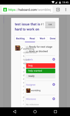
However, I there were some concerns – when I loaded the HuBoard site on my phone it was good to see that it adapted responsively to the space available and listed the items rather than displaying a grid (well, I’m still debating if that was good, but at least it was responsive.) However, when I then clicked on a issue:
Yuck! that’s not usable.
Edit: NB see note following stuff documented in following section about privacy has been changed.
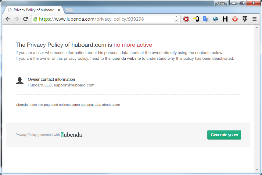
I then looked at the site to understand what the privacy policy was:
The only info on the site was “This Application collects some Personal Data from its Users”.
I’m pretty sure this is because of HuBoard not paying someone for their generated policy:
However, I tweeted at HuBoard:
.@Huboard your privacy policy page is not working – need to know more than the one liner. https://t.co/5dsSC6AkC2 pic.twitter.com/ZQtAF4mQTm
— Chris Paine (@wombling) September 1, 2015
And as at time of writing this post, haven’t had a reply. To me, if I’m going to trust a cloud service, I need to be able to understand what it will and won’t do with my data. A non-working privacy policy page on the main site is a BIG #fail. Then not to respond to someone @ mentioning your twitter handle is a mark of the kind of service that I might expect if I was a customer. Not great.
Edit: so none other than the founder of HuBoard reached out to me. Privacy policy is fixed. It looks pretty good too, most of it is in plain English not legalese. Guess timezones for USA meant they were sleeping. The founder reaching out, that’s pretty good customer service. These guys will hopefully do some great things!
Waffle
I looked at Waffle.io. Now bizarrely the thing that most scares me about that product is its price – $0. I’ve learnt, if I’m not paying $ for something, then I am the product. I’m not sure if Waffle.io is still in beta/investor funding and is happy running without making any money but perhaps just piling up the company valuation? This whole SaaS valuation model sometime confuses the crap out of me. When you consider that companies the size Workday have profit margins of -24% (I mean WTF ?) It’s quite conceivable that charging money right now doesn’t boost the value of the company as much as having more subscribed users. Still paying nothing for something just makes me want to look for the catch. But I couldn’t really find a catch (I imagine it won’t be free forever and that payment will be required soon, but if it’s in same sort of price point as HuBoard then this shouldn’t be an issue $24 a month to be productive is not that bad!)
Waffle has some feature that I thought were pretty good, but specifically I liked the “size” attribute for an issue. By using this I can ensure that for each stage of the Kanban there aren’t too many issues being dealt with. So it can be fine to have quite a few small issues, but having the same number of large issues could cause a problem.
at the top of each column was a counter showing the number of issues and the total size. Next to my lovely picture was a number showing what I thought the size of this issue was.
This functionality I like, it will help manage all the issues and ensure we’re not going crazy pushing so much to into testing without actually testing it.
It was also nice in Waffle to be able to see the number of comments an issue has – it’s often worth drilling into those issue that have a lot of comments, even if it’s not yet my issue.
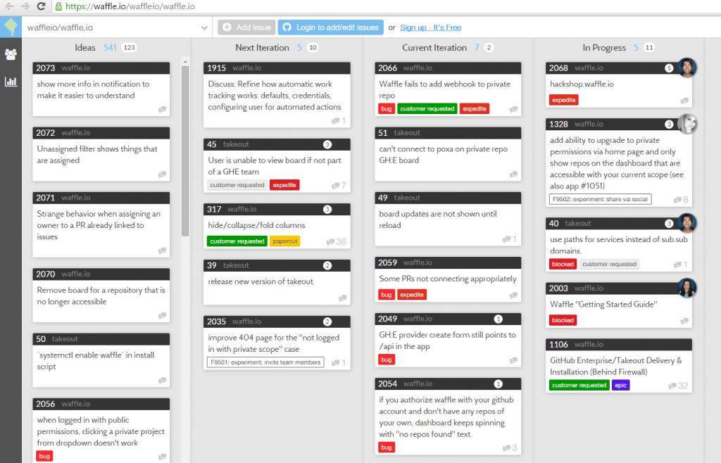
However, compared to HuBoard the amount of information shown can result in a quite busy screen – for example from Waffle’s own GitHub repo…
Personally, I didn’t mind the “noise” but others I spoke to thought perhaps the minimal style of HuBoard better. Since I often have so many labels that colour alone is going to be an issue, I think I prefer this layout.
In contrast to HuBoard the mobile interface is not at all responsive, you see the same site but just zoomed out so you can’t read anything. That said, pinch zooming and scrolling around on the phone isn’t hard, and it does give you a better perspective of how the lanes compare. I’m pretty sure that there is probably a better responsive layout that could be adopted. But compared to the rendering mess that happened in HuBoard when accessing from mobile, it was much easier to use the Waffle site.
Conclusion
You can probably see where I’m heading! I decided to go with Waffle for the moment, but I’ll keep an eye out for HuBoard. As with all these SaaS apps, iteration is the name of the game, and I’m sure that feature parity won’t be far off. Neither tool has an Android mobile app, but neither tool is very usable on a phone – so perhaps when one of them makes that leap it will differentiate itself. We shall see.
After I’ve been using Waffle for a while, I’ll perhaps write another post about “real life” experience.
Cheers!


