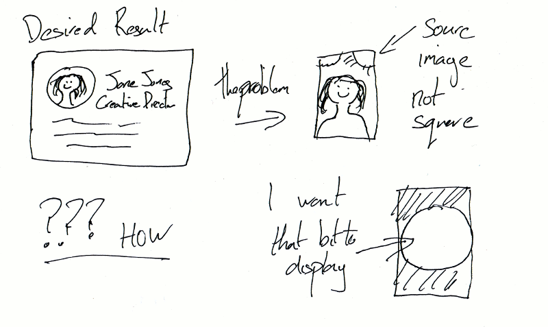
WARNING CODE AHEAD
<geek>
It took me probably too long to figure out how to do this so I thought I’d share.
To do this in a way that most browsers support wasn’t so obvious (to me).
in the end I did it by (approximately):
HTML
<div class="profile-image" style="background-image:url('profile-img1.jpg')">
 <img src="profile-img1.jpg">
</div>
CSS:
div.profile-image {
 width: 47px;
 height: 47px;
 background-repeat: no-repeat;
 background-position: center center;
 background-size: cover;
 overflow: hidden;
 border-radius: 23.5px;
 -webkit-border-radius: 23.5px;
 -moz-border-radius: 23.5px;
 box-shadow: 0 0 4px rgba(0, 0, 0, .8);
 -webkit-box-shadow: 0 0 4px rgba(0, 0, 0, .8);
 -moz-box-shadow: 0 0 4px rgba(0, 0, 0, .8);
 border-radius: 23.5px;
}
div.profile-image img {
min-height: 100%;
min-width: 100%;
 /* IE 8 */
-ms-filter: "progid:DXImageTransform.Microsoft.Alpha(Opacity=0)";
 /* IE 5-7 */
 filter: alpha(opacity = 0);
 /* modern browsers */
 opacity: 0;
}
The image tag is in there so it’s still possible for the user to interact with the image, i.e. save it if they want, but it is made see through.
So the user “sees” the background image which is positioned such that it covers the div, so all of circle will have content, and the middle bit of image will be shown. The circle is made by making the border radius half the width of the div.
The important bits were the “background-size: cover;” and the “background-position:center center;”
Obvious when you know how.
</geek> (as if!)
credits to : http://stackoverflow.com/questions/11552380/how-to-automatically-crop-and-center-an-image for the inspiration!

